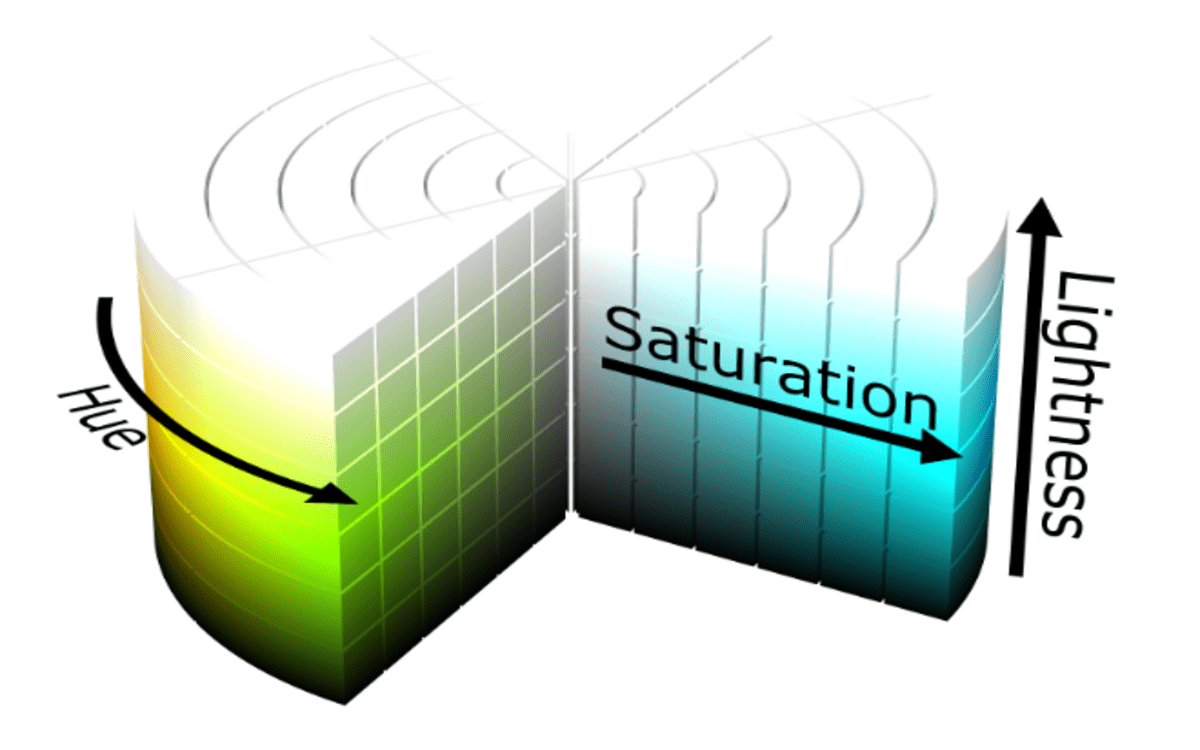
In design, color is more than just decoration—it’s a language that conveys mood, emotion, and hierarchy. While monochromatic schemes rely on a single hue, analogous color schemes expand the palette by combining colors that are adjacent on the color wheel. This approach creates visually harmonious yet dynamic designs. By using the HSL (Hue, Saturation, Lightness) color model, you can craft beautiful analogous palettes with ease.
In this guide, we’ll explore how to create an analogous color scheme with HSL and provide practical tips for applying it in web design, graphic projects, and more.
Step 1: Select a Base Hue
Start by choosing a base hue on the 360-degree HSL color wheel. The hue determines the main color of your scheme. For instance:
- 0° = Red
- 60° = Yellow
- 120° = Green
- 240° = Blue
This base hue sets the tone of your palette. For example, if you select 200° (blue), your analogous colors will be the hues immediately next to it, creating a smooth and pleasing transition.
Step 2: Determine Your Analogous Range
Analogous schemes typically include three to five colors:
- Choose the base hue.
- Select one or two hues to the left and right of the base on the color wheel.
For example, with a base hue of 200° (blue), an analogous palette might include:
- 180° – A cyan-blue
- 200° – The base blue
- 220° – A blue-purple
This combination ensures color harmony while adding visual interest.
Step 3: Adjust Saturation for Depth
Once you’ve chosen your hues, tweak the saturation to create variety:
- High saturation (80–100%) = vibrant, attention-grabbing colors
- Medium saturation (40–60%) = balanced, calm tones
- Low saturation (10–30%) = soft, subtle shades
Adjusting saturation across your analogous colors helps establish emphasis and hierarchy in your design. For example, a highly saturated base can be paired with softer accents for a refined look.
Read Also: Yale KeyExpress
Step 4: Adjust Lightness for Contrast
Lightness defines how dark or light a color appears. Varying lightness across your analogous palette adds depth and readability:
- High lightness (70–90%) = ideal for backgrounds or large areas
- Medium lightness (40–60%) = suitable for primary design elements
- Low lightness (10–30%) = perfect for text, borders, or accents
By balancing lightness across your palette, you can prevent the design from feeling flat or monotonous.
Step 5: Combine Hues, Saturation, and Lightness
Now it’s time to bring it all together. Using HSL, you can define your analogous colors precisely. For example:
| Color | HSL Value | Usage |
|---|---|---|
| Cyan-Blue | HSL(180, 70%, 60%) | Backgrounds or highlights |
| Base Blue | HSL(200, 100%, 50%) | Primary elements |
| Blue-Purple | HSL(220, 70%, 50%) | Buttons, accents |
This combination ensures harmony while providing enough variety to create a dynamic and engaging design.
Styling Tips for Analogous Palettes
- Use Lightness for Visual Hierarchy: Highlight key elements with darker or more vivid colors, while lighter tones can serve as backgrounds.
- Mix Saturation Levels: A saturated base paired with muted analogs maintains balance and readability.
- Add Neutral Accents: Whites, blacks, or grays can complement your palette and prevent overwhelming the viewer.
- Test Accessibility: Make sure your color choices provide enough contrast for text and essential UI elements.
By experimenting with HSL adjustments, you can create a professional and aesthetically pleasing design that feels cohesive and natural.
Example Palette for Inspiration
Here’s a practical analogous palette based on a base hue of 200° (blue):
- Cyan-Blue: HSL(180, 70%, 60%) – Subtle background
- Blue: HSL(200, 100%, 50%) – Primary elements
- Blue-Purple: HSL(220, 70%, 50%) – Buttons and accents
Visualizing your palette helps ensure each color works in harmony while standing out where it matters. You can find converted HSL to HEX codes on the RGB-Hex for easy implementation in your projects.
Conclusion
Analogous color schemes are perfect for designs that need harmony and subtle variety. By using HSL to adjust hue, saturation, and lightness, you can craft palettes that are both visually cohesive and flexible. Whether you’re designing websites, graphics, or interiors, an analogous approach allows creativity while maintaining balance.
This method is a natural next step if you’re familiar with monochromatic palettes—it expands your color toolkit while staying rooted in color theory.
